


Accessible signage is the part of a buildout that people assume they have handled because they bought signs with Braille on them. The restroom plaques have dots, the room numbers have dots, the order was placed from a catalogue, and the box is ticked.
Braille is one requirement among several, and it is not the one that fails most often. The common failures are where the sign is mounted, what it is made of, how it reads under light, and whether it says the right thing at all. Those failures are invisible to someone who is not looking for them and obvious to someone who is, which includes inspectors, tenants, and anyone in a position to file a complaint.
Two Sets of Rules, and California Is Stricter
Accessible signage in California answers to federal requirements under the ADA Standards for Accessible Design and to the California Building Code, whose accessibility provisions in Chapter 11B are in several respects more demanding than the federal baseline.
This matters because a sign package specified to the federal standard, ordered from an out-of-state supplier, can be non-compliant in California even though it satisfies the ADA. California has its own requirements around certain sign types, geometric symbols on restroom doors, and specific character and finish provisions that catch national vendors out.
The practical consequence: signage should be specified to California requirements from the start, and questions about a specific project belong with the local building department or an accessibility specialist rather than a supplier’s product description.
Not Every Sign Is a Tactile Sign
The requirements differ by what the sign does, and applying tactile rules to everything is as much a mistake as applying them to nothing.
- Signs identifying a permanent room or space, such as restrooms, stairwells, and numbered rooms, require raised characters and Braille.
- Directional and informational signs, such as wayfinding arrows and directories, do not require tactile characters but do have requirements for character proportion, contrast, and finish.
- Signs identifying spaces subject to change, such as a nameplate for whoever currently occupies an office, are generally treated differently than permanent room identification, which is why swappable inserts exist.
- Egress and exit signage carries its own requirements under fire and building code, separate from accessibility.
Getting this wrong in the generous direction wastes money on tactile signs that were not required. Getting it wrong in the other direction leaves a compliance gap on the signs that mattered.
Mounting Position Is the Most Common Failure
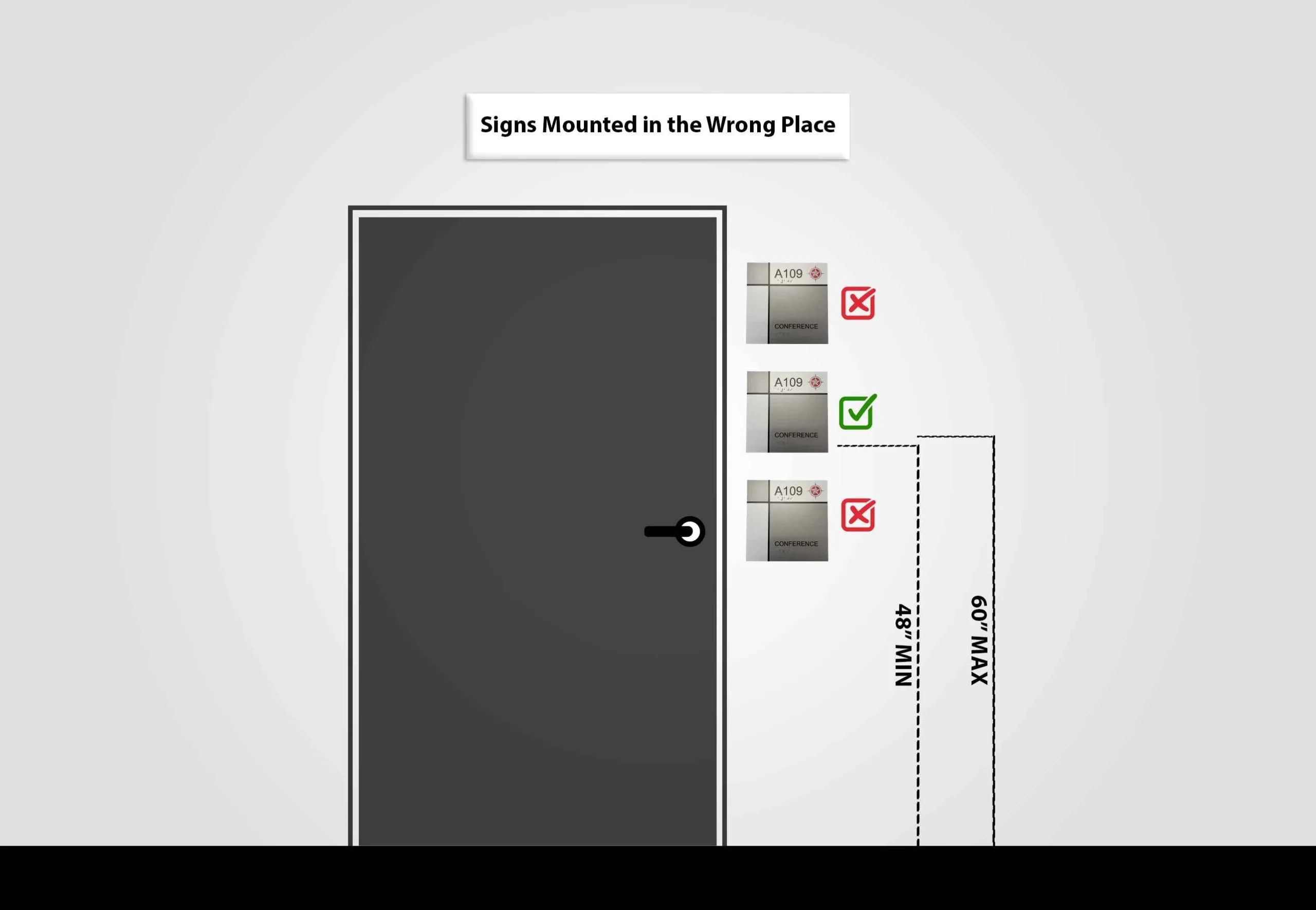
A perfectly manufactured tactile sign mounted in the wrong place is not compliant, and this is where most existing installations fall down.
Tactile signs identifying a room must be mounted at a specified height range measured to the characters, and they belong on the wall adjacent to the latch side of the door rather than on the door itself. Someone reading by touch needs to locate the sign without standing in the swing of the door, which is the entire reason for the rule.
Where there is no wall space on the latch side, the standards address the alternative, and that situation needs deliberate resolution rather than defaulting to the door face. Approach space in front of the sign matters too: a sign a person cannot stand in front of, because a fixture or furniture blocks it, defeats the purpose.
Double doors, doors that open into corridors, and signs installed at the wrong height by a general contractor working from a plan sheet rather than the standards are all recurring sources of correction.
Contrast, Finish, and Glare
Characters must contrast with their background, light on dark or dark on light. This is easy to satisfy and easy to undermine with a design decision, since brand colors close in value to each other can look elegant and read as a single field to someone with low vision.
Finish is the requirement most often overlooked entirely. Both characters and background must be non-glare. A polished metal or high-gloss acrylic sign can be beautiful, correctly proportioned, correctly mounted, and still non-compliant because of its finish, which under corridor lighting can wash out completely.
Typography is constrained as well. Tactile characters must be sans serif, uppercase, without italic, script, or highly decorative treatment, and character height, stroke thickness, and spacing all fall within specified ranges. Raised characters also need to be genuinely raised to the required depth, which is why appliqué and photopolymer methods produce different results and why very cheap tactile signage sometimes fails on measurement alone.
Braille Details That Get Missed
Braille must be Grade 2 contracted Braille, positioned below the corresponding text, with dots of the specified shape and spacing. Domed or rounded dots are the requirement, and flat or square dots, which some production methods produce, are not acceptable.
Translation errors are their own category of problem. Contracted Braille is not a character-for-character substitution for printed text, and a supplier producing it by automated conversion without review can output something that reads incorrectly. This is worth verifying on a proof rather than discovering after installation across an entire building.
Where This Comes Up Beyond Inspection
Accessibility signage carries exposure that other signage does not. California has an active history of accessibility litigation, and interior signage is among the easier items for a complainant to document because the deficiencies are visible in a photograph and measurable with a tape.
The categories most affected are commercial tenant spaces, multi-tenant office buildings, medical offices, restaurants, and retail, particularly after a renovation or a change of tenant when signage gets replaced by whoever is doing the buildout rather than by someone specifying to the standards.
Signage should be part of the accessibility scope of a project rather than a finishing purchase. Working with a fabricator who produces to California requirements routinely removes most of the risk. Los Angeles Sign Company produces ADA and tactile signage alongside architectural signage, interior and storefront signs, and provides design, manufacturing, permitting, and installation, with more than twenty years in the signage industry and coverage across Los Angeles and neighboring cities. Whichever supplier is used, the proof should be reviewed against the applicable standards before a full building package goes into production.
Doing an Honest Walkthrough
A useful self-assessment takes an hour with a tape measure and a camera.
- Identify every permanent room and space that requires tactile identification, and confirm each one has a sign.
- Measure the mounting height to the characters on each tactile sign, and note anything outside the required range.
- Confirm each tactile sign is on the latch side of the door and not on the door face.
- Check that nothing obstructs the approach to any sign.
- Look at every sign under the actual corridor lighting for glare and for contrast between character and background.
- Run a hand across the characters to confirm they are genuinely raised rather than printed.
- Photograph and log everything, since a documented remediation plan is a materially better position than no record at all.
This is a screening exercise, not a certification. Anything ambiguous, and any building where the exposure is significant, warrants review by a qualified accessibility professional.
Key Takeaways
- California accessibility requirements exceed the federal ADA baseline in several respects, so out-of-state stock signage can be non-compliant here.
- Tactile characters and Braille are required for permanent room identification, not for every sign in a building.
- Mounting position is the most frequent failure: correct height range, latch side of the door, clear approach.
- Non-glare finish is a requirement, and polished or high-gloss signage fails it regardless of how well it is made.
- Tactile characters must be sans serif and uppercase, with specified height, stroke, spacing, and raise depth.
- Braille must be Grade 2 contracted with domed dots, and automated translation should be checked on a proof.
- Signage belongs in the accessibility scope of a project, not in the finishing purchases.
Frequently Asked Questions
Do office nameplates need Braille?
Signs identifying spaces whose designation changes, such as the occupant of an office, are generally treated differently than permanent room identification. A room number that stays with the room is more likely to require tactile identification than the name of whoever currently sits there, which is why insert systems are common. The specific determination depends on how the space is identified and should be confirmed for the project.
Can ADA signage match our brand colors?
Often yes, within constraints. The requirement is contrast between characters and background plus a non-glare finish, not a specific palette. Brand colors that differ substantially in value can work. Two brand colors that are similar in value, or a signature metallic finish, are where conflicts arise, and that is a design conversation worth having before the package is specified.
Does a historic building have to comply?
Historic status does not create a blanket exemption, though there are provisions addressing alterations to historic properties where compliance would threaten significant features. This is a determination that requires professional review rather than assumption, and it typically applies to physical alterations more than to signage, which is often achievable without affecting historic fabric.
What happens after a compliance complaint?
Outcomes vary with the nature of the claim and the jurisdiction, and can involve remediation, costs, and legal expense. The practical point is that demonstrated good-faith effort, meaning documented assessment and a remediation plan already underway, is a considerably better position than no record of having looked. Specific situations warrant legal advice rather than general guidance.
Do interior directional signs need to be tactile?
Directional and informational signage generally does not require raised characters and Braille, but it is still subject to requirements around character proportion, contrast, and finish. Treating directional signage as unregulated because it is not tactile is a common misreading.
Who is responsible in a leased space, tenant or landlord?
Both can carry obligations, and lease language allocates responsibility differently across arrangements. Common areas typically sit with the landlord while tenant premises sit with the tenant, but that is a default rather than a rule. Since accessibility obligations are not always fully delegable, confirming the allocation in writing is worth doing rather than assuming the other party has it handled.
Conclusion
Accessible signage is one of the least expensive compliance items in a building and one of the most frequently deficient, largely because it looks finished once Braille is present. The requirements that get missed are mundane: a height range, a side of a door, a finish that does not glare, characters raised far enough to read by touch. None of that is difficult to specify correctly the first time, and all of it is tedious to correct across a building afterward.
